Idea & Concepts
At the early stage of logo development, the designer started to explore the idea of the new healthy lifestyle, new approach to the restaurant business and futuristic service.
From the very beginning, there appeared the concept of red silk ribbon which would convey those associations. As a result of the creative search for the symbol, the designer came up with an idea to take the first letter of the company name and give it an image of the red ribbon and save the futuristic mood that service brings.



Logo Official

refinement and character of the interiors, the uniqueness of the service,
and the niche industry they occupy.
Stationary
Business Card
To design business cards, we created a catchy graphic element: the red ribbon which would represent brand’s idea of the new lifestyle.
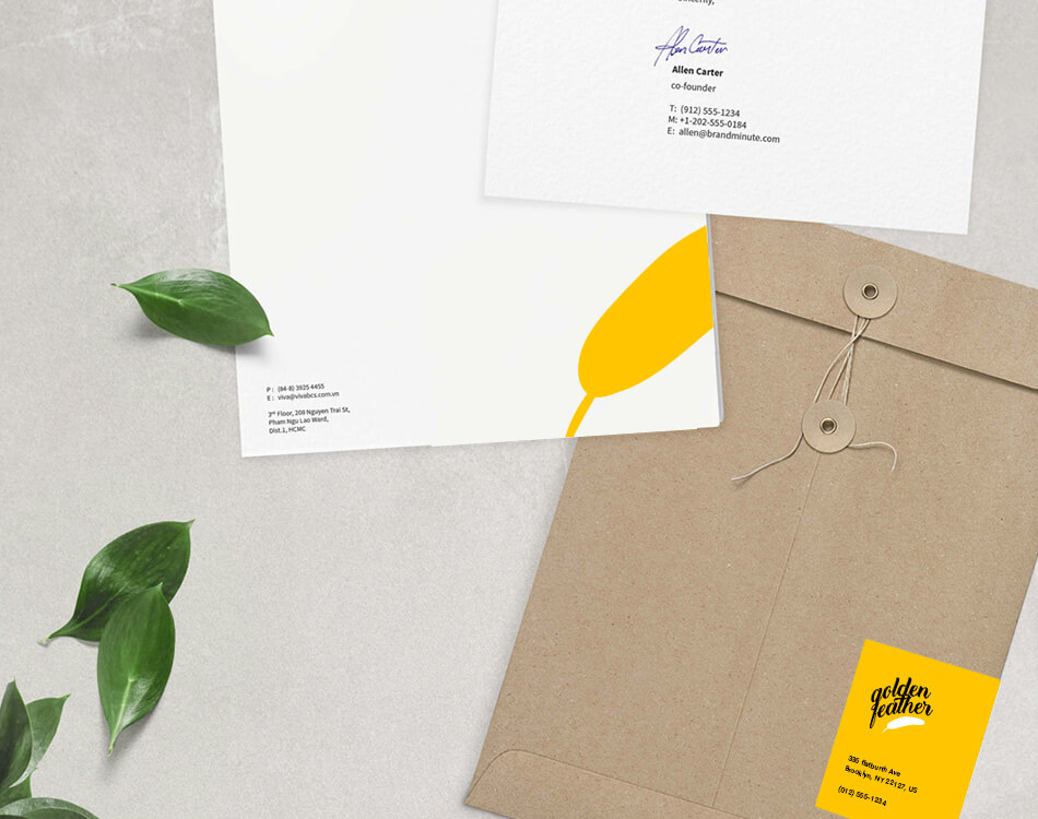
Envelope
For minimalistic and stylish look, the envelope design featured solid colors and the simplified version of the logo.
Letterhead
The letterhead followed the general stylistic concept and consistent visual presentation. The designer created the unique and though-out layout of the information.
